Simplicity at scale
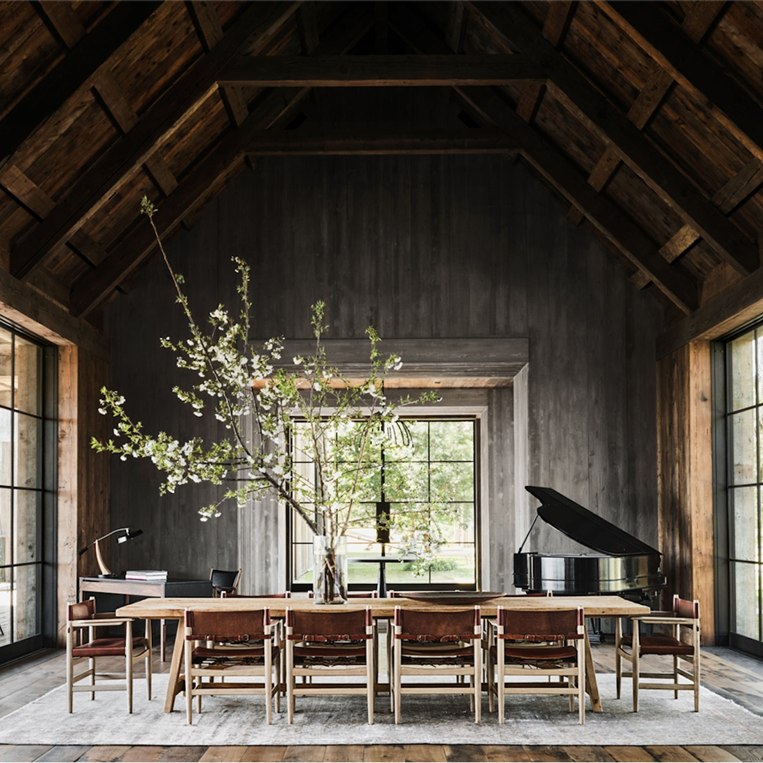
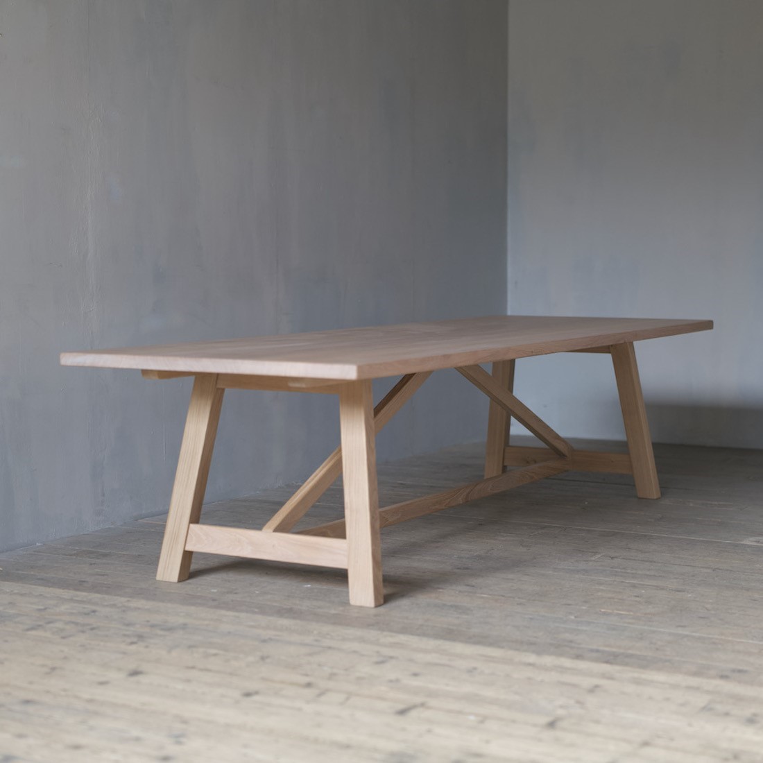
It seems everyone's seen the incredible photographs from the Kunis/Kutcher Architectural Digest feature but we have to add our tuppenceworth too... because what we really love about this project is how something as pared-back as our Orangery table can create a stir through its sheer scale and honesty of surface. It's unexpected but also serves a purpose. It holds its own in the space as both a functional and decorative object that will stand up to kids, comedians and the changing of fashions.
We don't talk publicly about our clients (unless they start the conversation!) but we do love working with Charles & Co and are thrilled they chose this very design for such an awe-inspiring space.
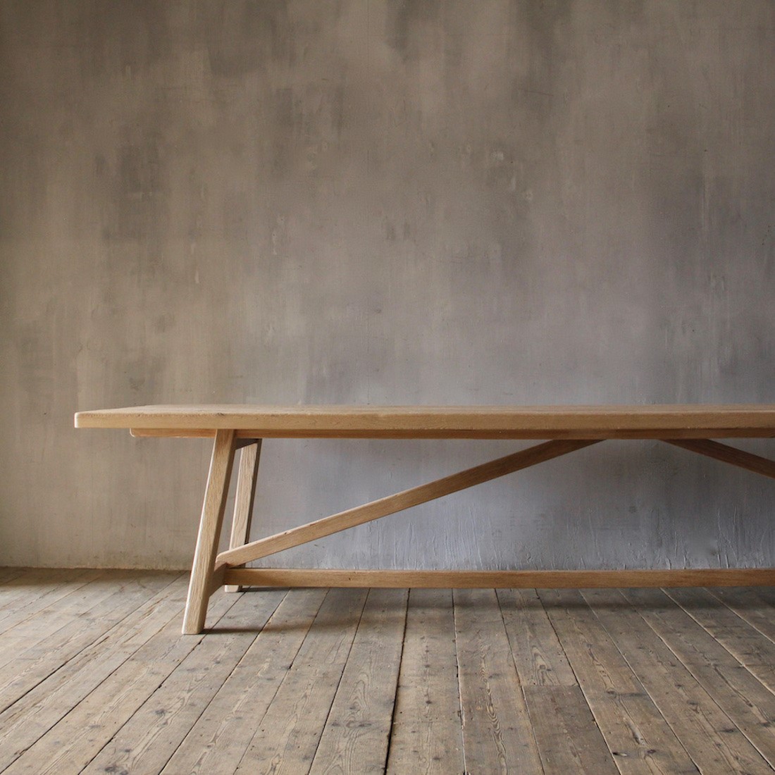
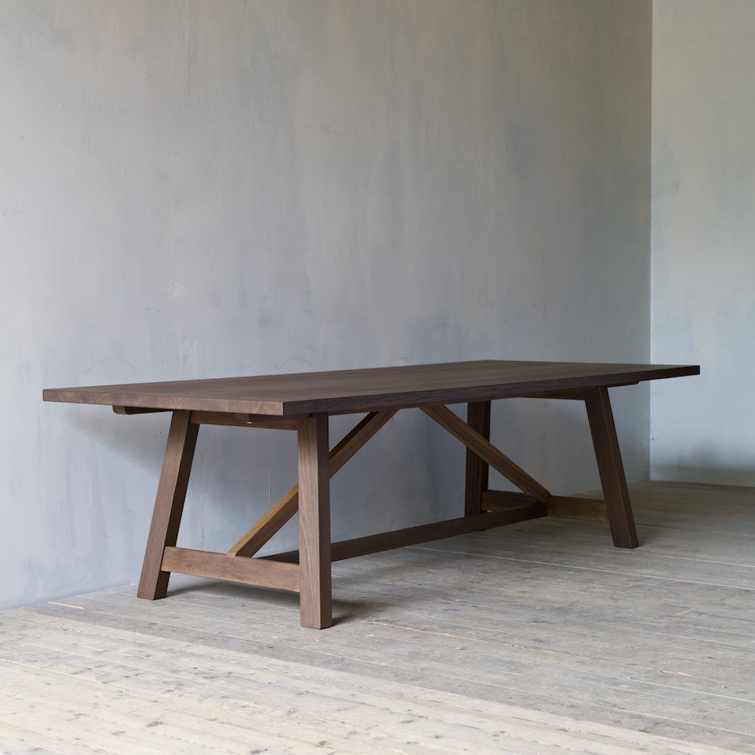
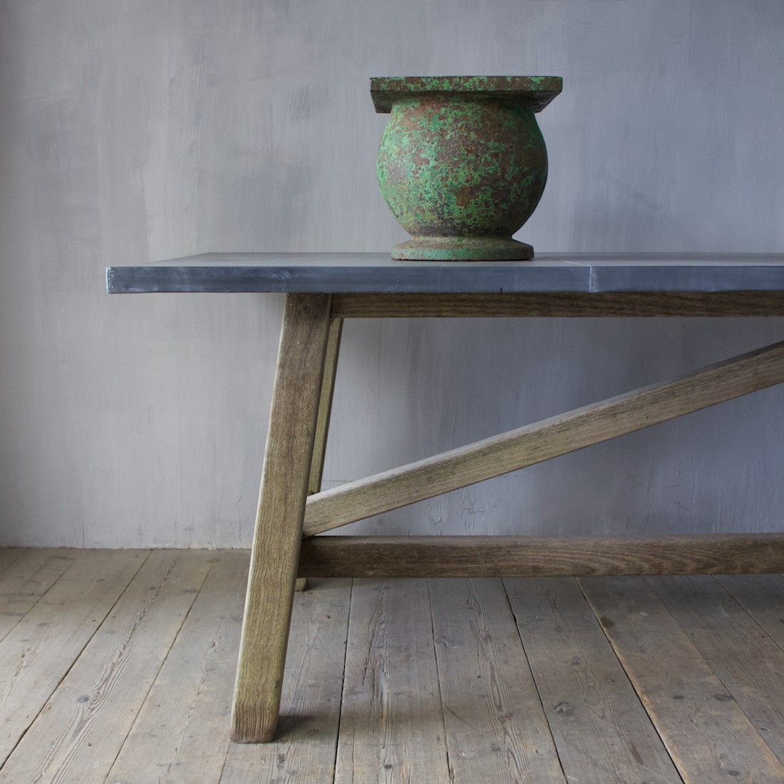
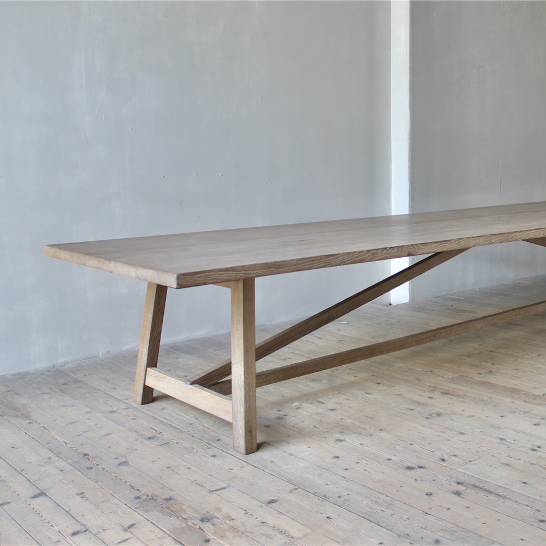
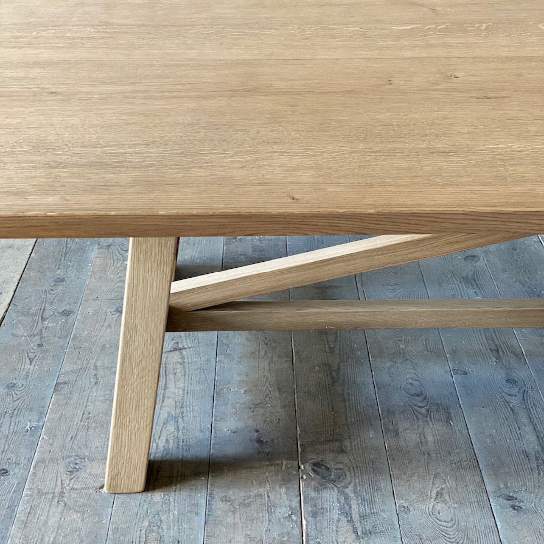
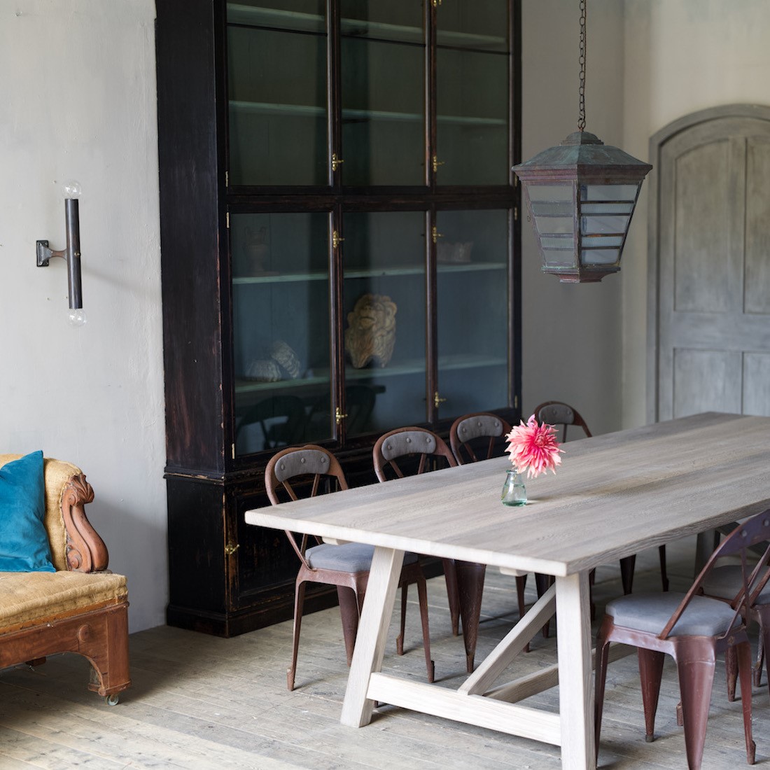
When Matthew creates pieces for our collection, he wants the design and construction to stand the test of time but he also wants them to be ingenious in their adaptability; and the Orangery table looks just right whether it's 1.5 metres long or 5 metres, a dark fumed oak or a worn raw oak with a weatherworn zinc top.
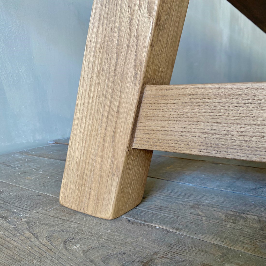
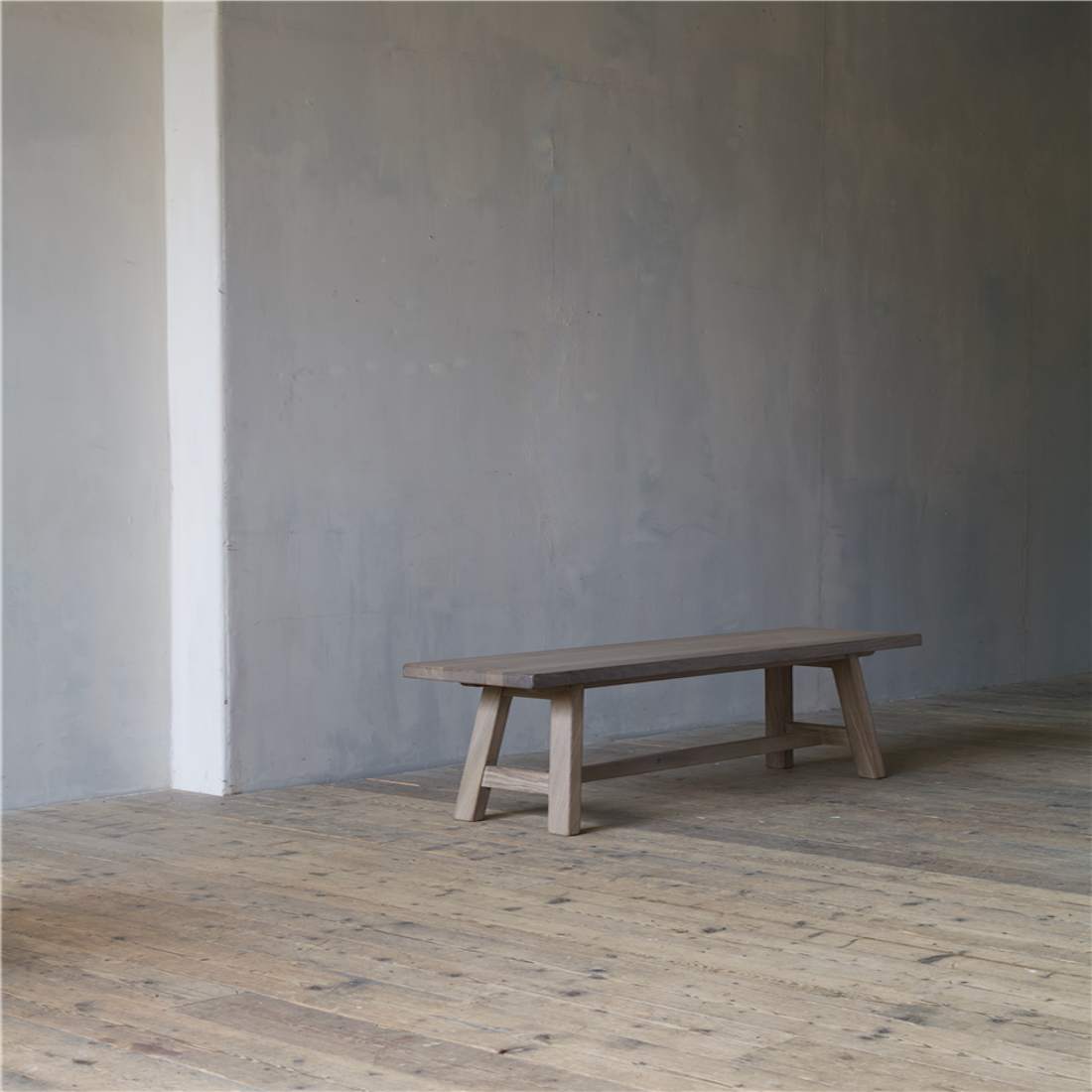
Along with now familiar Californian farmhouse shot, we've included a selection of some of our favourite Orangery tables at a variety of scales, as well in different finishes. And we've also thrown in a couple of Orangery bench shots for good measure!
You can see the full Architectural Digest piece here.
And our Orangery table page here.

